White oak · raw linen · bleached jute
Coastal staging, without the rope and anchors.
For oceanfront condos, beach cottages, and waterfront listings. White oak, raw linen, and bleached jute against the actual coastal light — not the Pinterest version with starfish on the wall.
Cinq crédits offerts — sans carte bancaire.
 AvantAprès
where it came from
Born in California, refined in the Hamptons, finally legible everywhere.
Coastal as a style emerged in two places independently — postwar Southern California beach towns (Malibu, Santa Monica, La Jolla) and the Hamptons of the 1960s–80s. Both shared a problem: how do you furnish a house whose best feature is the light coming off the water? The answer was reductive. Strip the palette to warm neutrals. Use textures that absorb light rather than reflect it (linen, jute, bleached oak, plaster). Avoid anything that competes with the view — no busy patterns, no high-saturation color, no statement pieces. The cliché version that bolted starfish, ropes, and reclaimed-wood signs to this foundation came later, mostly from late-2010s home retail. The original is still the right reference.
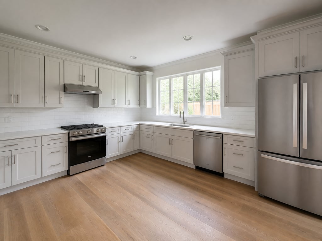
the material vocabulary
Light-absorbing, weathered, never glossy.
- White oak, cerused or limed
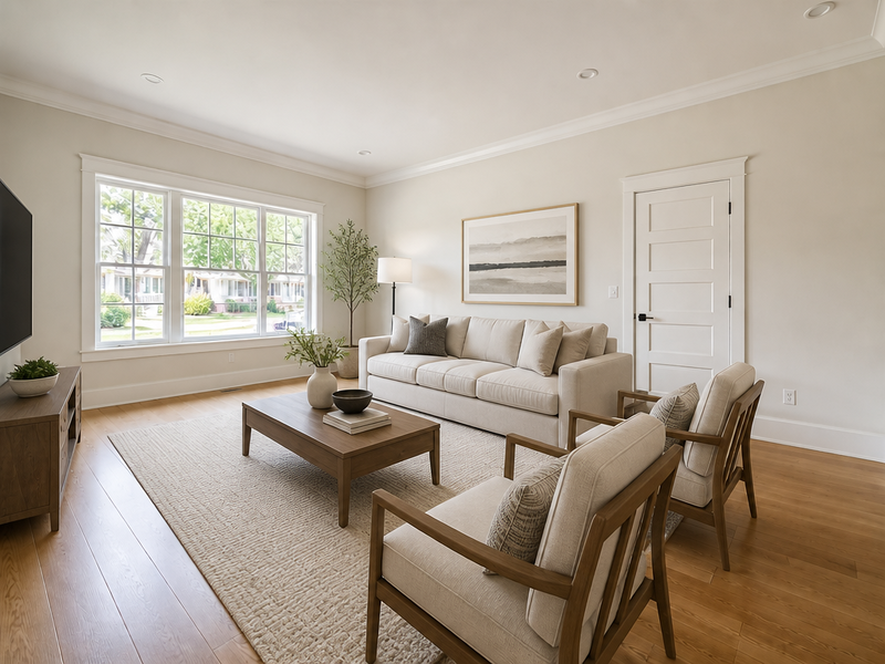
- For coffee tables, dining tables, kitchen islands, flooring. The grain stays visible; the finish is matte. Avoid anything stained dark — it kills the room.
- Raw linen and washed cotton
- For upholstery, drapery, bedding. Heavy texture, neutral color, slightly rumpled. Crisp white only on bedding; everything else in oatmeal, sand, or pale dove.
- Bleached jute and seagrass
- For rugs, baskets, light fixtures. Brings the warm neutral floor anchor without the formality of wool or the visual noise of patterned rugs.
- Plaster, lime wash, or shiplap
- For walls. Plaster and lime wash give depth without color; horizontal shiplap reads coastal when matte white and used selectively (one wall, a built-in nook).
- Aged brass or matte black hardware
- For knobs, faucets, lighting. Aged brass for warmer rooms, matte black for cleaner contemporary takes. Chrome and polished nickel read 2008 and should be replaced.
the palette
Warm neutrals layered. No bright colors. No "ocean blue."
- Oatmeal#D8CDB6Upholstery, rugs, drapery
- Bleached oak#C9B393Casework, tables, flooring
- Sand#BBA77BWalls, throw pillows
- Pale dove#E6E1D6Bedding, ceilings, accent walls
- Sea glass (used sparingly)#A4B5AESingle ceramic piece, art accent only
where it sings
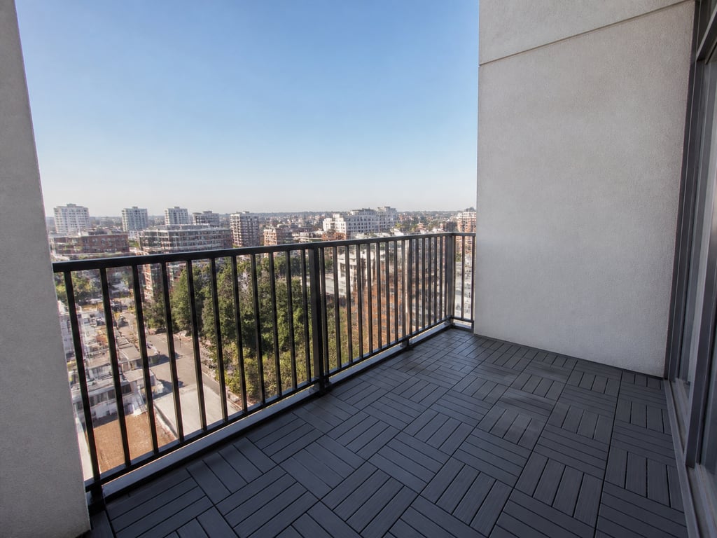
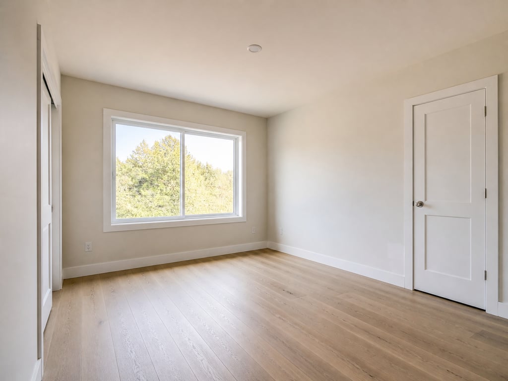
Coastal works hardest in three rooms.
Living room with water view
When the window is the hero, Coastal lets it stay the hero. Low oatmeal sectional facing the view, bleached oak coffee table, jute rug, one piece of art on the back wall. The room photographs as restraint.
Primary bedroom
Pale dove bedding, washed linen drapery, a single bleached oak nightstand on each side, plaster walls. Buyers see a bedroom that earns the description 'serene' instead of a hotel suite.
Open kitchen-dining
Lime-washed walls, white oak island, oatmeal counter stools, a single woven pendant overhead. The kitchen reads coastal without putting a single piece of nautical décor in the shot — which is the whole point.
Coastal en pratique
De vraies annonces, mises en scène en Coastal.
 AvantAprès
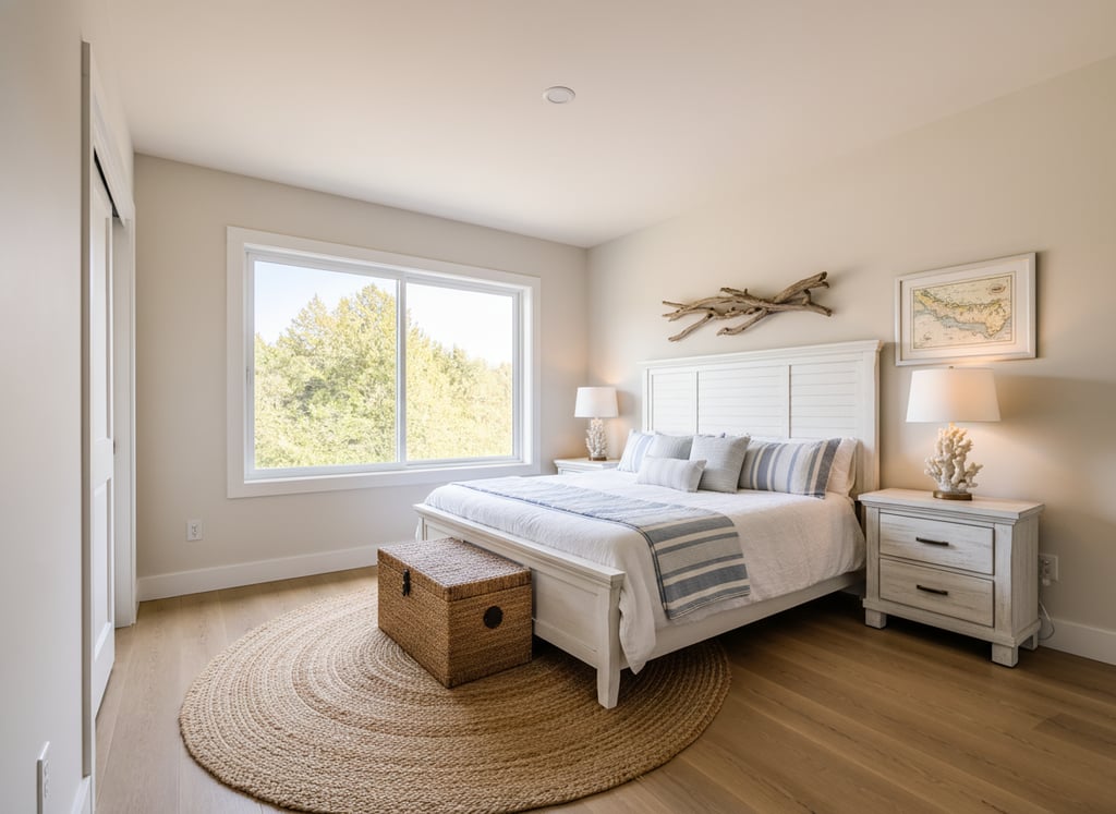 AvantAprès
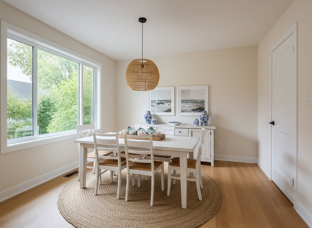 AvantAprès
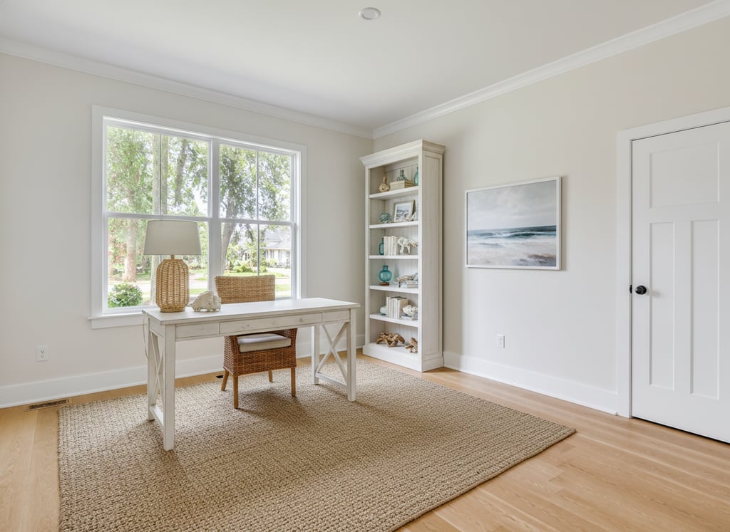 AvantAprès
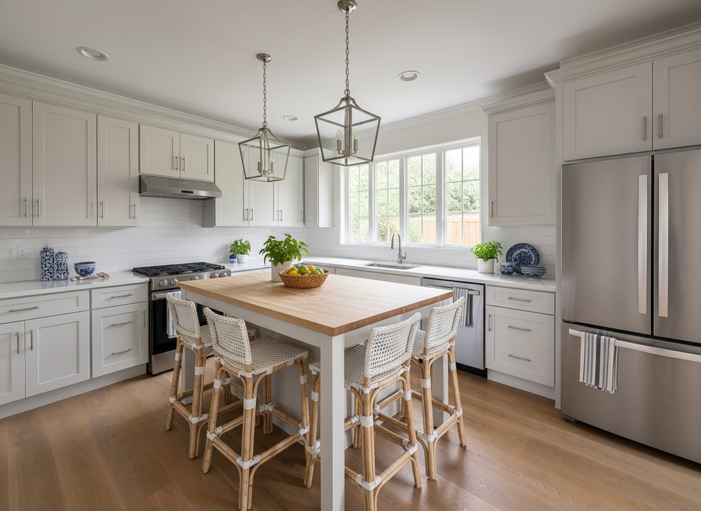 AvantAprès
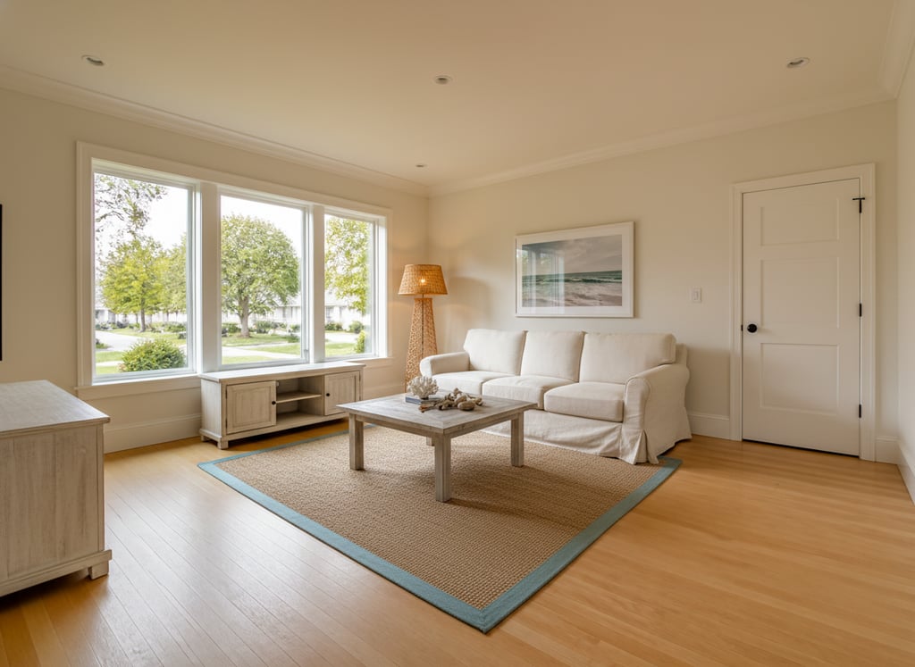 AvantAprès
Questions
What agents ask before staging a beach or waterfront listing.
Coastal staging — frequently asked
Common questions
Beachy means rope, starfish, mason jars, reclaimed-wood 'GONE TO THE BEACH' signs, blue-and-white striped pillows — the late-2010s Pinterest version of coastal. Coastal is the original: warm neutrals, restrained palette, the architecture and the view as the heroes. Vestaro's Coastal pack uses the original. If you want the beachy version, the Bohemian or Farmhouse packs come closer.
Yes, when the architecture supports it — sun-filled great rooms, large windows, indoor-outdoor flow. A craftsman bungalow with a big southern exposure can read coastal; a north-facing pre-war condo cannot. Use it where the natural light is the room's strongest asset.
There's deliberate overlap — both use pale woods, neutral palettes, restrained styling. The difference: Coastal is warmer (oatmeal, sand, bleached oak), Scandinavian is cooler (ash, white, pale gray). Coastal includes seagrass and lime wash; Scandinavian doesn't. For a Westside LA, Hamptons, or Pacific Northwest waterfront listing, Coastal is the call. For a Midwest or Northeast urban listing without a water connection, Scandinavian usually fits better.
Stage to disappear. Low-profile sectional facing the view, no tall furniture between the buyer's eye and the window, neutral palette so nothing competes. Vestaro's Coastal pack defaults to lower silhouettes specifically to keep the sightline clean. For the hero photo, point the camera through the staged living room toward the view — buyers should see the staged interior as the frame, the ocean as the picture.
Get started
Your next listing deserves better photos.
Start staging in seconds. No credit card, no design skills.
Drag & drop your listing photo here
JPG, PNG, WebP, AVIF, HEIC